About
Templates & Graphics
FAQs
Client Stories
Product Gallery
Request a Quote
Custom Playing Cards
Custom Card Games
Custom Tarot Cards
Custom Flash Cards
Products
Custom Playing Cards
Custom Card Games
Custom Tarot Cards
Custom Flash Cards
Site Navigation
About
Templates & Graphics
FAQs
Client Stories
Product Gallery
Custom Playing Cards
Custom Card Games
Custom Tarot Cards
Custom Flash Cards
Home
Blog
uncategorized
uncategorized
Ledgewood Fine Stationery Flexes Their Craft for an Elegant Texas Celebration
For this Texas wedding, Frances Ledgewood and the team at Ledgewood Fine Stationery created a custom deck of playing cards that doubled as an elegant
Read More...
Uncategorized
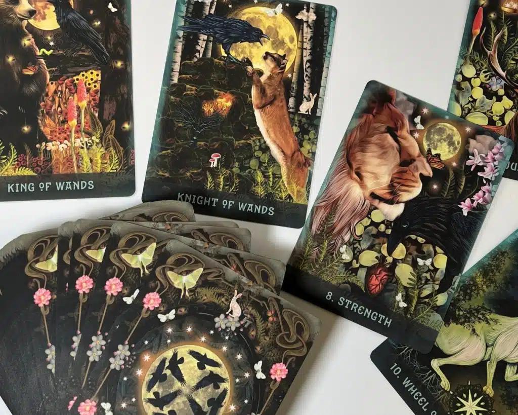
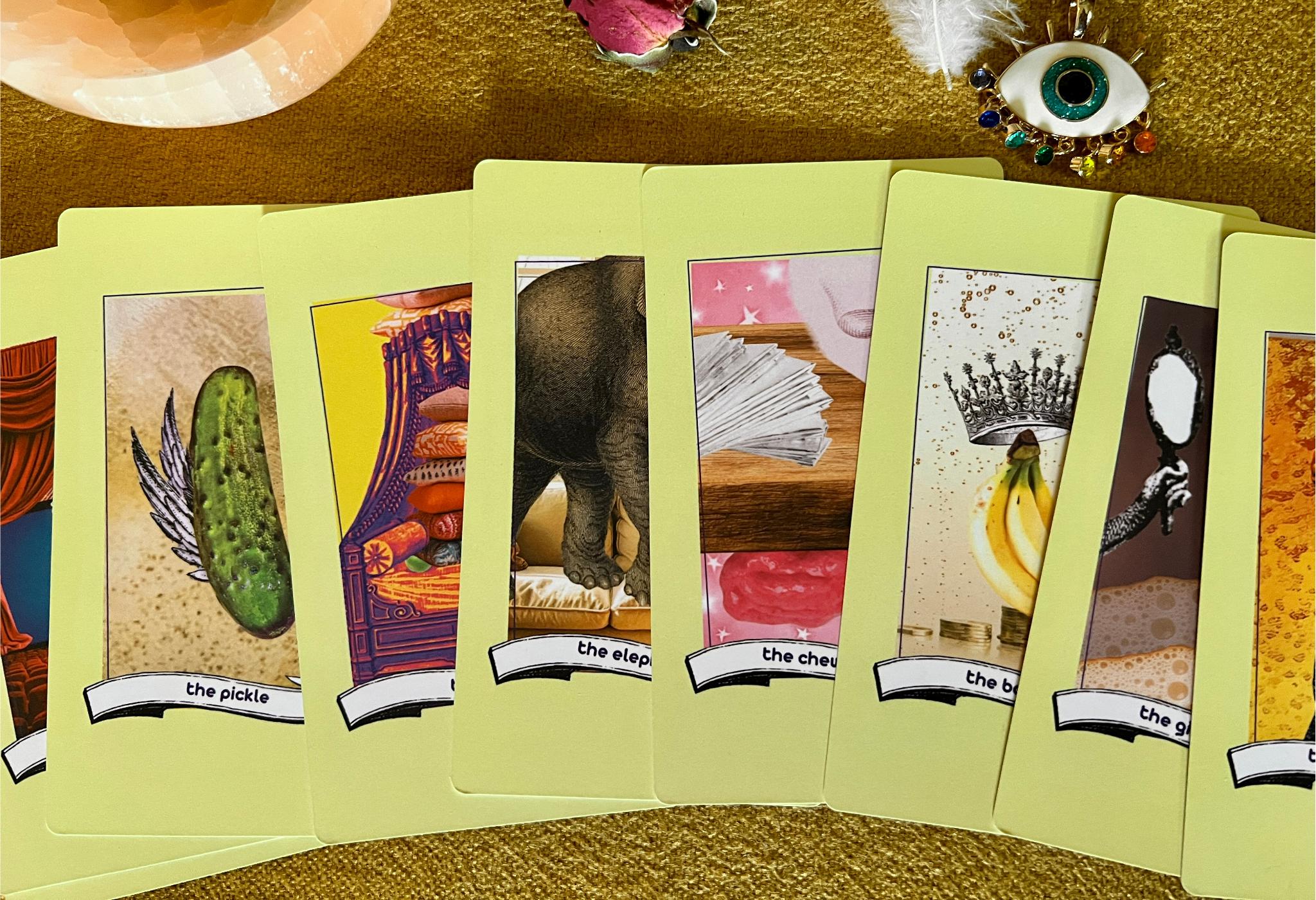
Found Oracles: An Interactive Storytelling Art Project Told Through Oracle Cards
Found Oracles by Bailey Lewis is not a traditional oracle deck. It is an evolving storytelling art project where cards act as entry points into deeper
Read More...
Uncategorized
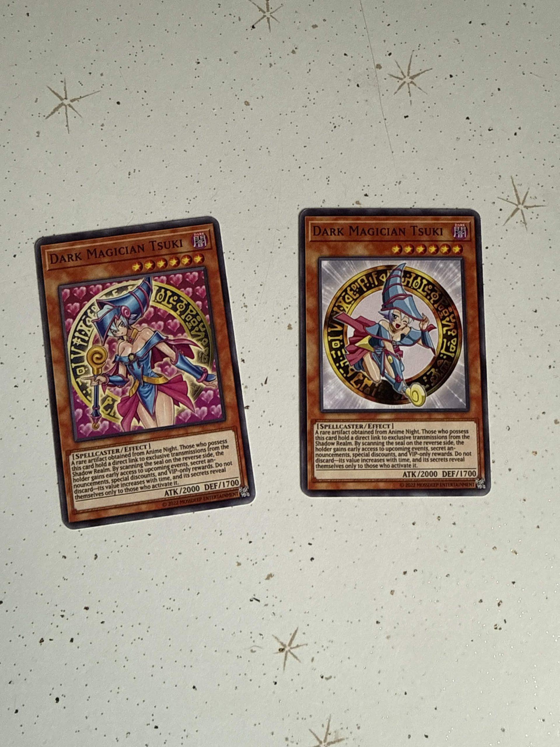
Anime Night®: Turning a Yu-Gi-Oh Inspired Business Card Into a Collectible Experience
For most brands, a business card is just contact information. For Anime Night®, it became part of the experience. Created by Evan Tuccarello, Anime Ni
Read More...
Uncategorized
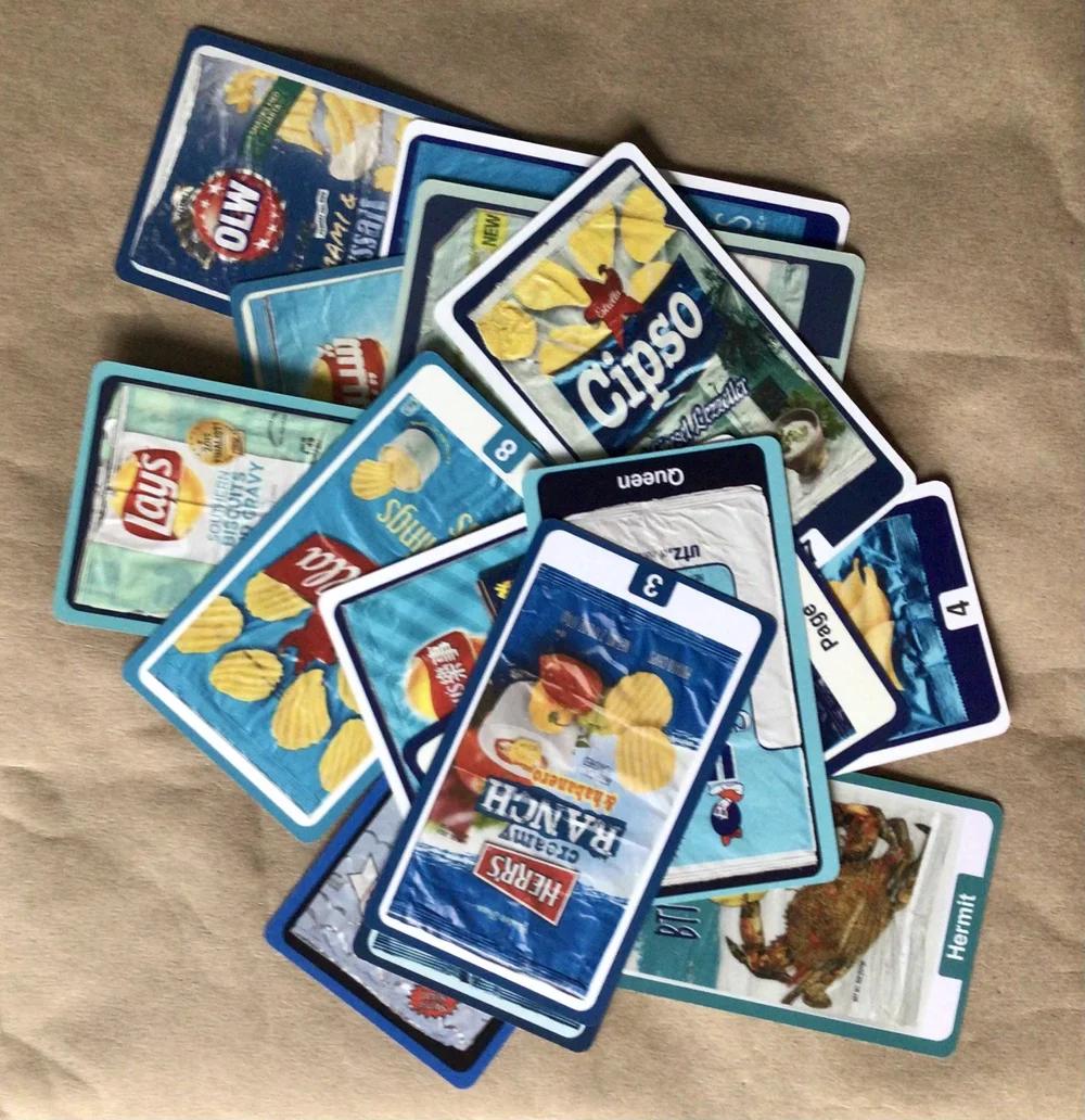
Chip Bag Tarot: A Tarot Deck Inspired by Potato Chip Bags Around the World
Chip Bag Tarot by Anne Weshinskey is exactly what it sounds like and somehow much more. It is a full tarot deck where both the Major and Minor Arcana
Read More...
Uncategorized
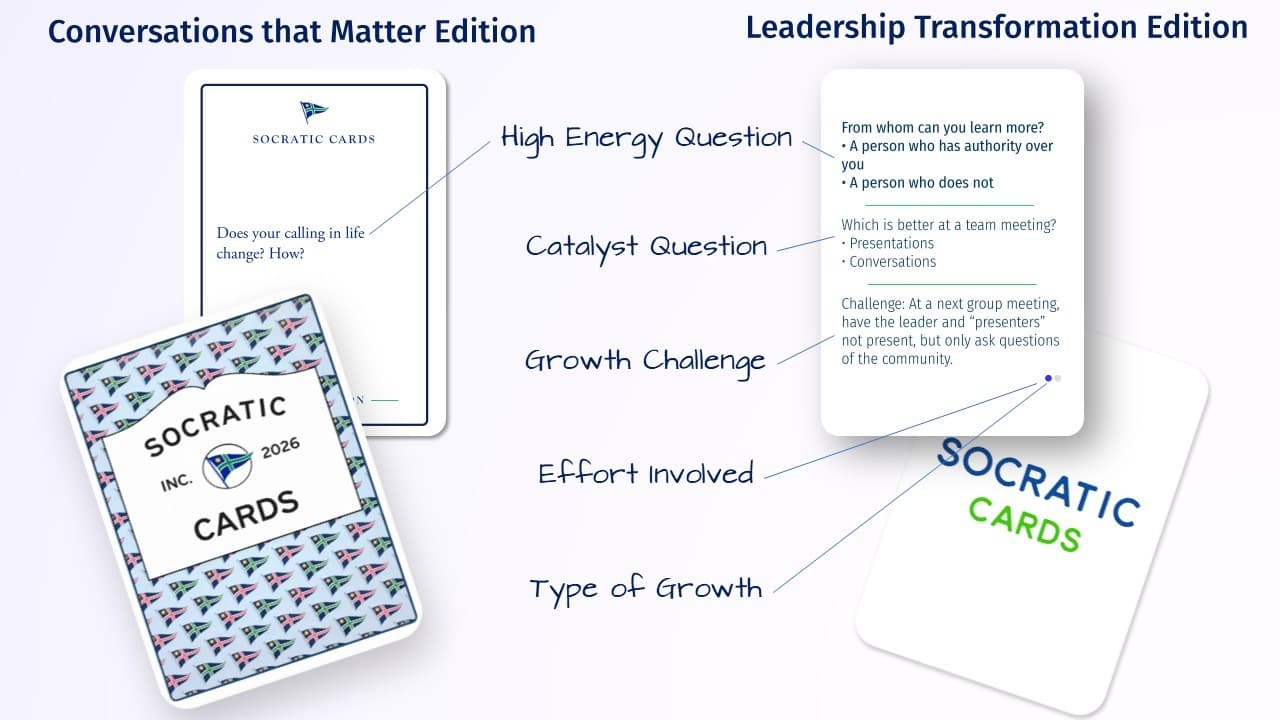
Socratic Cards: A Question-Based Card Game That Stays With You
Most card games are built around quick answers, points, and competition. Socratic Cards by Clark Aldrich takes a very different approach by centering
Read More...
Card Designers
Card Games
Card Innovation
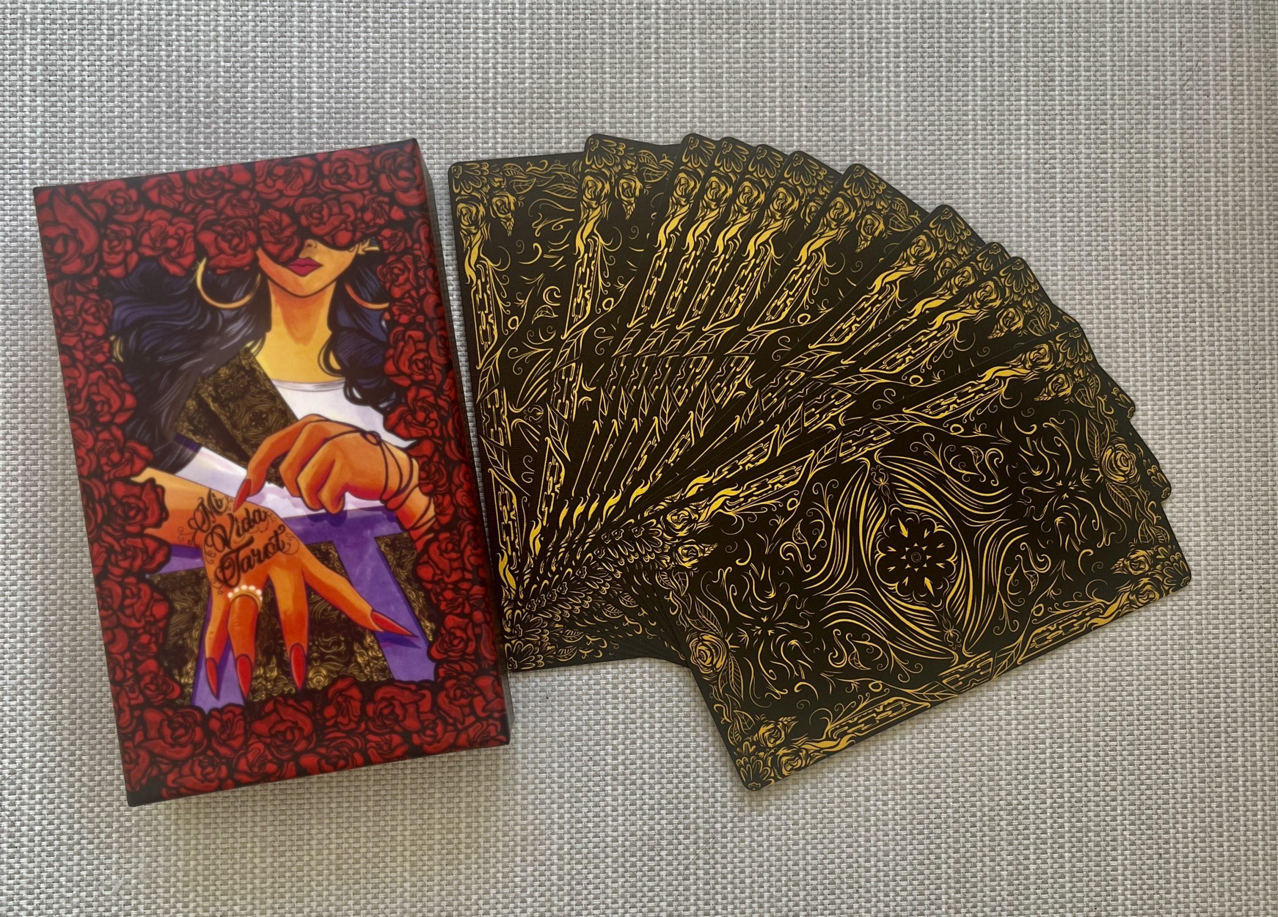
Mi Vida Tarot: A Love Letter to Culture, Memory, and Becoming
Some projects are planned. Others are lived. Mi Vida Tarot by Mel Morales is the latter—a deck born not just from artistic vision, but from memory, id
Read More...
Uncategorized
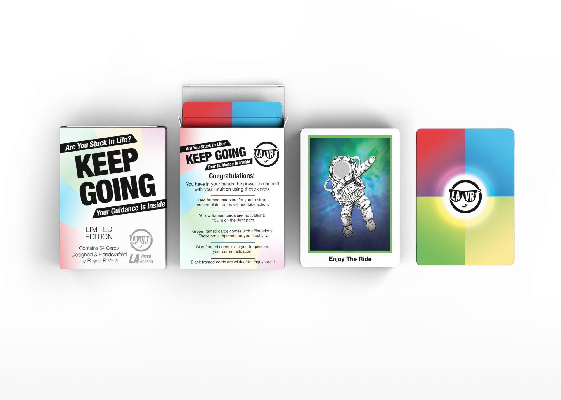
KEEP GOING: An Intuitive Guidance Deck by LA Visual Reason
“The glass is almost full, always.” That’s the motto behind LA Visual Reason’s first card project, the KEEP GOING Guidance Deck: Clear The Path For Yo
Read More...
Uncategorized
Celestial Forms by WYRAINE: A Journey into Card Design
Every artist has a defining moment that sparks the beginning of a new journey. For WYRAINE, that moment came during their first year of college, when
Read More...
Uncategorized
Edition and Their Core Values Cards for Wealth Architect University
For Edition, great design is about more than aesthetics—it’s about intention. Their latest project, a striking deck of Core Values cards, is a p
Read More...
Uncategorized
1
2
3
4
5
6
7
8
9
10