A Staycation Sparked It All
Stefanie had no plans to create a card deck. But during a solo staycation in the middle of the COVID-19 pandemic, everything changed.
“I checked into a hotel just to rest. I brought my laptop, thinking maybe I’d write,” she recalls. “That night, the cards just started pouring out of me.” With over 30 years in corporate America and a lifelong passion for metaphysics, Stefanie has quietly combined the two worlds for years. Known only to close friends and referrals, she has long offered intuitive readings—but always kept that part of her life under wraps.
“I’ve always used metaphysical principles in my work life,” she says. “It helps me to step back and look at the larger picture.”
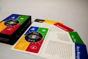
Rather than using traditional card illustrations, The Office Oracle Cards feature clear text messages printed directly on each card. The design speaks plainly to the user, offering intuitive prompts for real-life workplace issues.
Designed by Friends, Finalized with Trust
The original design was created by a close friend from Stefanie’s early career. When he had to step away due to family health matters, another friend stepped in to help finish the deck. One card—Return to Office—was added late in the process after Stefanie realized it was essential.
“Regardless of which side you are on, it impacts the office in a way we never had to deal with previously.”
While excited to share her creation, Stefanie admits to some nerves. “This project shines a light on a part of my life I’ve kept pretty private,” she says. She hopes The Office Oracle Cards help others find clarity in their careers and relationships at work. “We spend most of our week working. I hope people are able to use the deck to find guidance for situations in the workplace?”
Partnering with Shuffled Ink
When Stefanie tried working with other printers, she struggled to explain the deck’s concept. “I had issues explaining the concept of these cards to another printer.”she recalls. But once her friend, Chris, discovered Shuffled Ink, everything clicked. “Shuffled Ink understood what we were trying to do and made it very simple for us.”
For anyone dreaming of creating their own oracle card deck, Stefanie offers this:
“Don’t lose faith in the process. Things may seem to stall, but there may be a reason for that stall that you don’t understand yet. A stall in a project may be for your highest good.”
Launching Spring 2025
The Office Oracle Cards will be available for purchase at www.ouroracles.com in Spring 2025. Orders will ship within 48 hours of purchase.
Stefanie’s personal mission is to reach financial freedom so she can focus more on spiritual tools and passion projects. She also plans to expand the deck into retail stores nationwide.
Request a quote here.

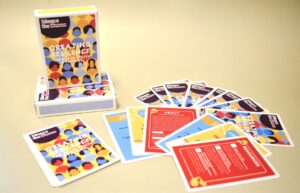 At Silence the Shame, we believe that strong communication and emotional expression are the cornerstones of mental well-being. For Black youth and families, navigating emotions can be particularly challenging due to societal pressures, generational trauma, and limited access to culturally competent mental health resources. That’s why we created the
 The Look, The Feel, The Vibe of Boozanga!

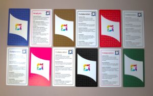
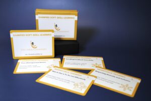
 At Champlain College, education goes beyond traditional lectures and textbooks. Through the Embedding the College Competencies grant, funded by the Davis Educational Foundation, Champlain College is fostering a dynamic learning experience that equips students with 12 essential skills—including Collaboration, Creativity, and Communication. To make these competencies more accessible and engaging, a team of students has developed an innovative deck of competency-based cards. Manufactured by Shuffled Ink, this unique project is bringing education to life in a fun and interactive way.